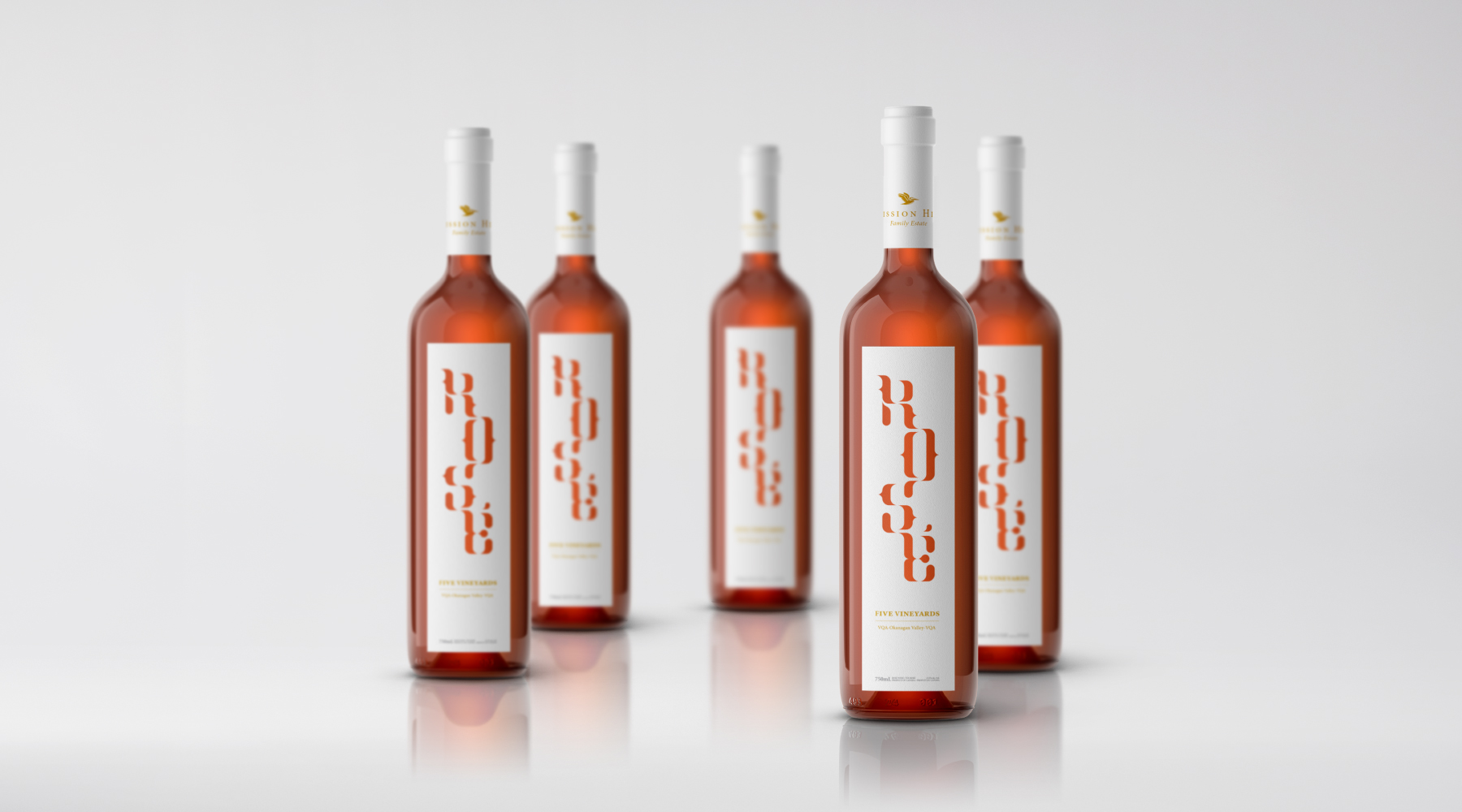
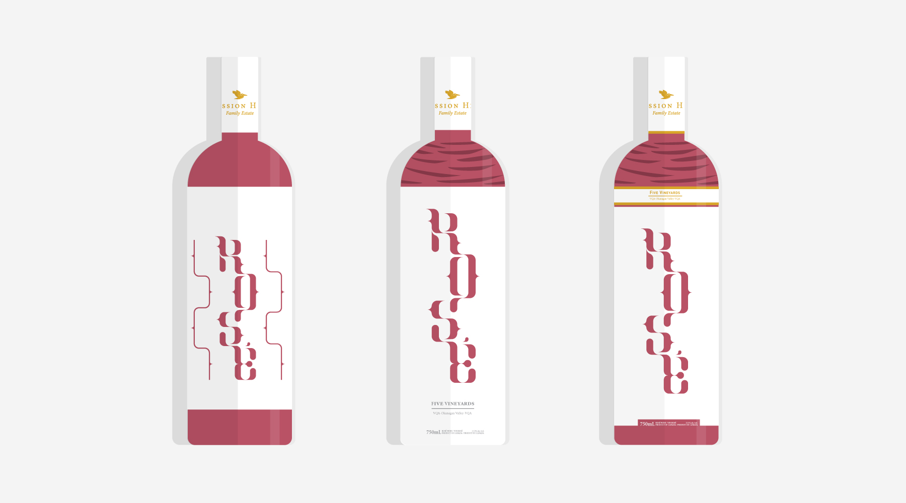
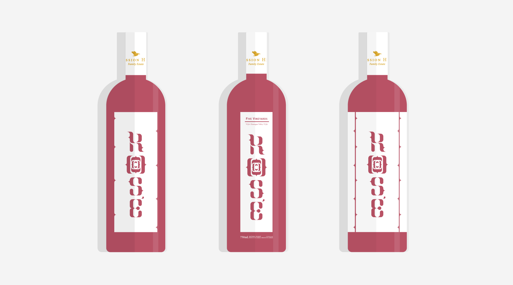
rosé wine label
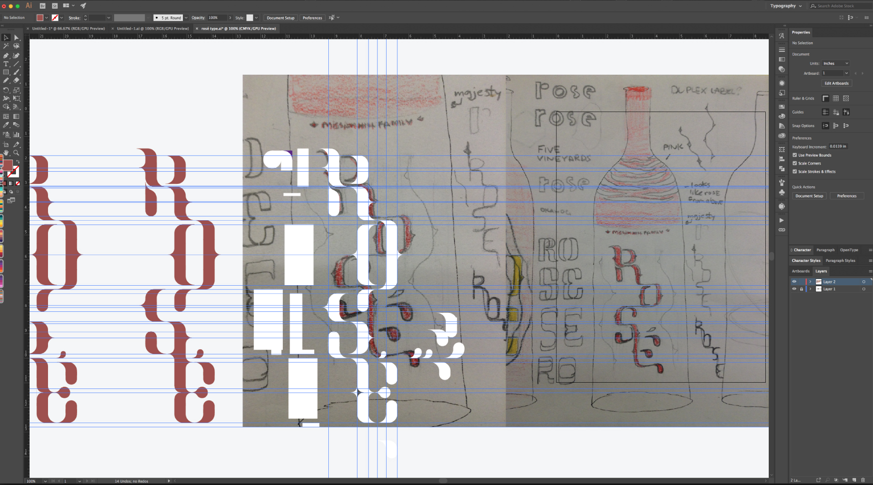
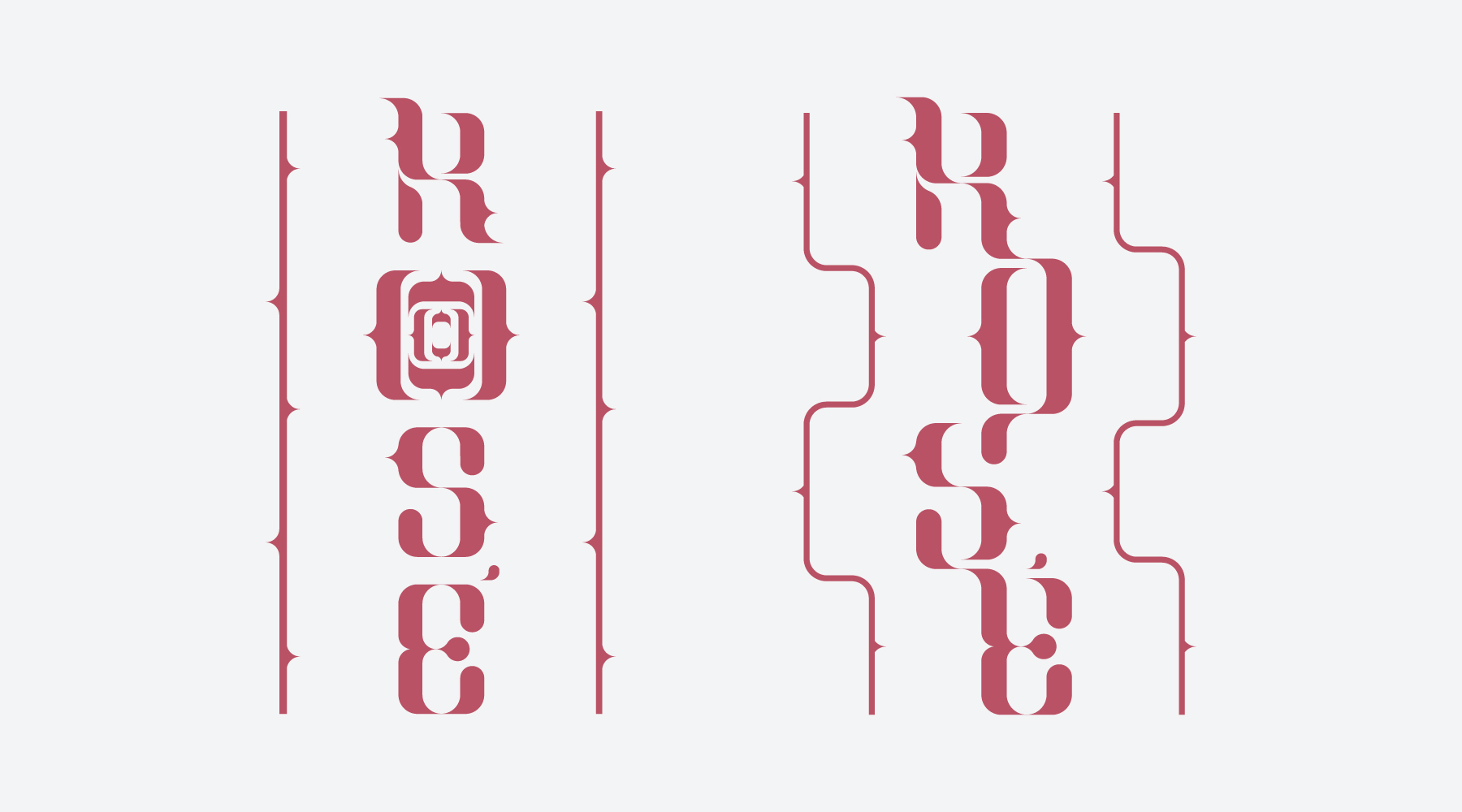
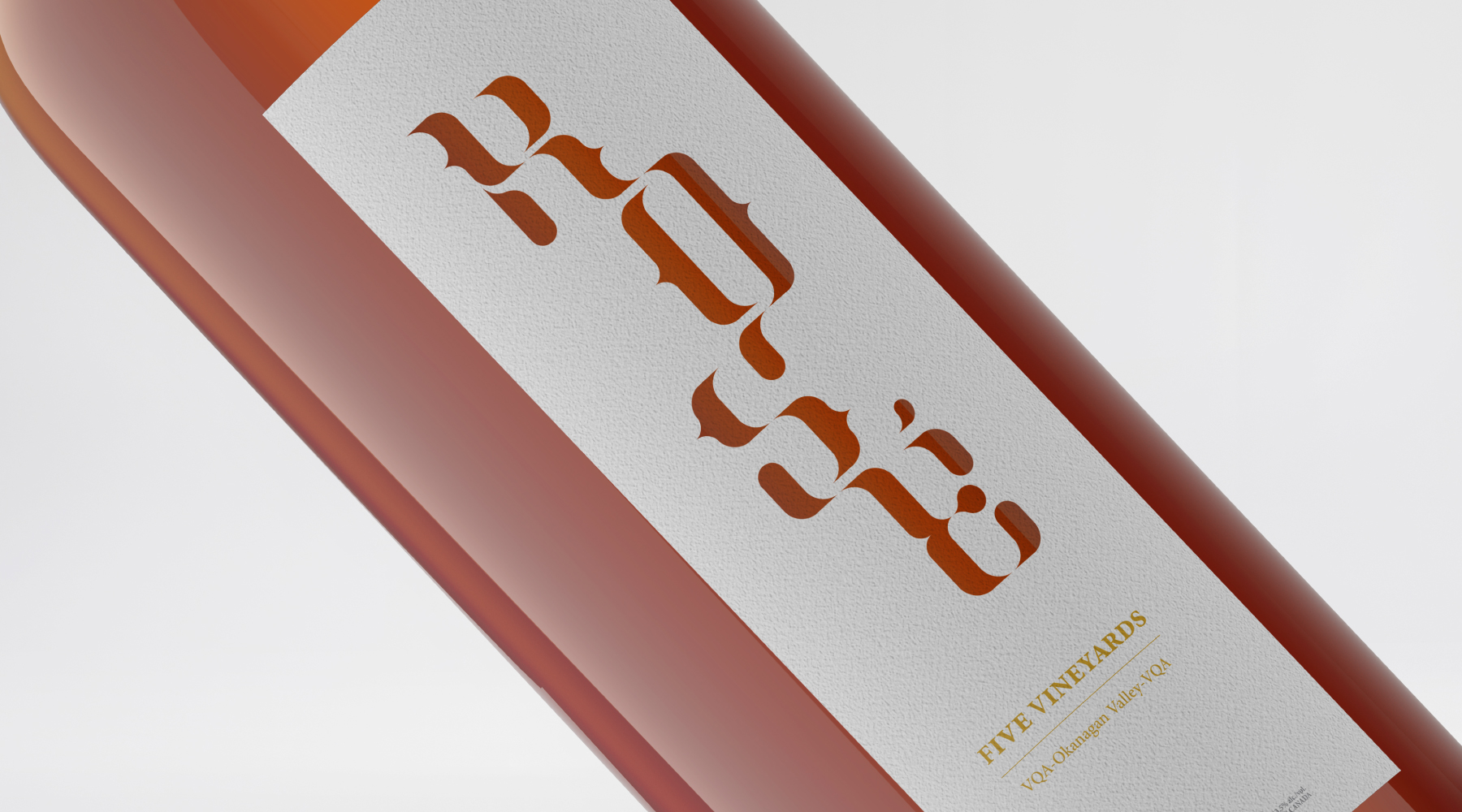
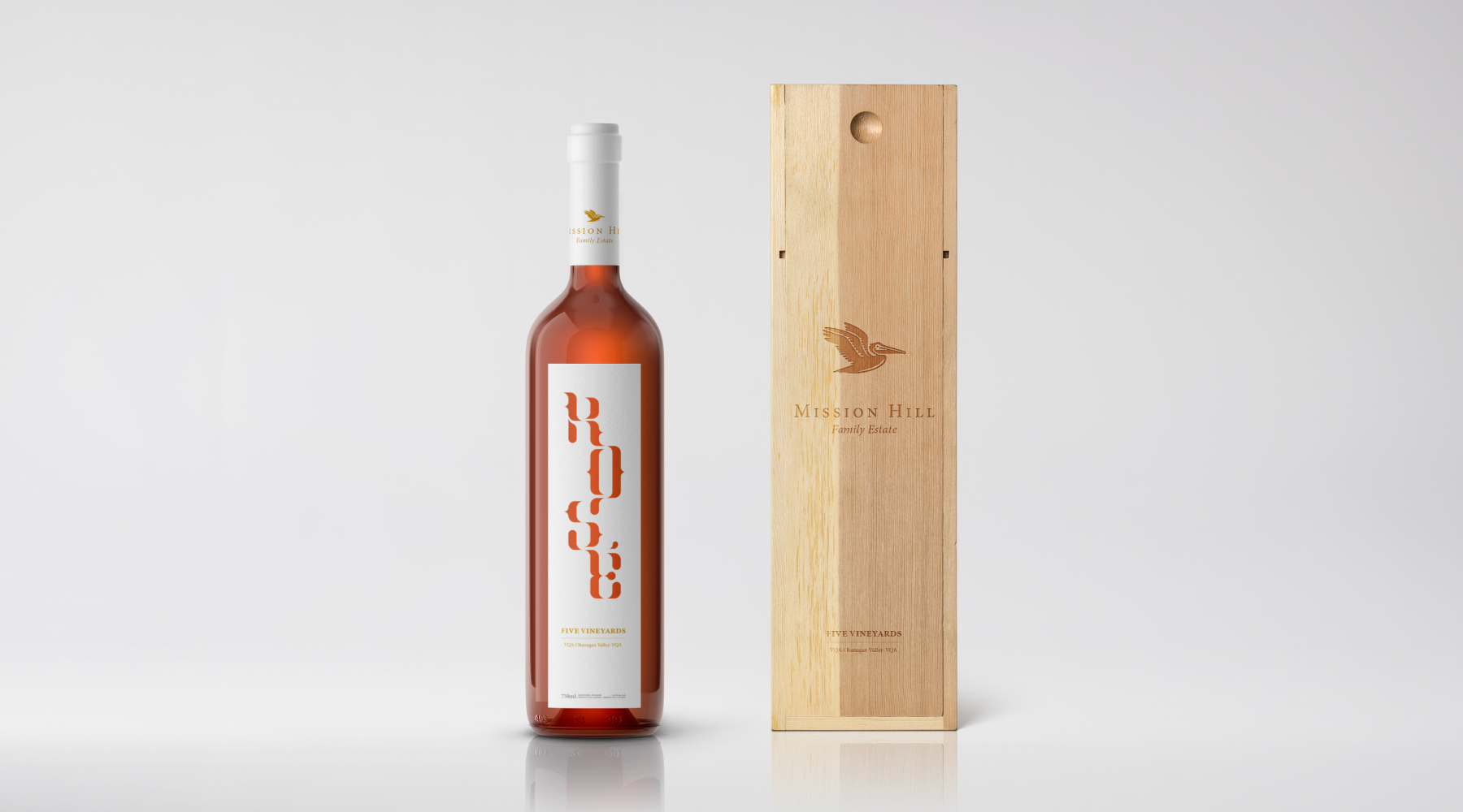
Mission Hill has unique architecture on their property, showcasing a narrow rectangular tower that the labels shape signifies. This element is also seen on other Mission Hill wine labels and helps to unify this design with the others. On any given wine shelf there are very few wine labels that are white and have a shape running vertically. So a label such as the new design would standout to the customer within context. The main element of the label is the word Rosé. It was created to take form as a rose stem as the strokes of each letter flows into the next. Also bringing forth the fact the winery is a family estate symbolizing connectedness.
